
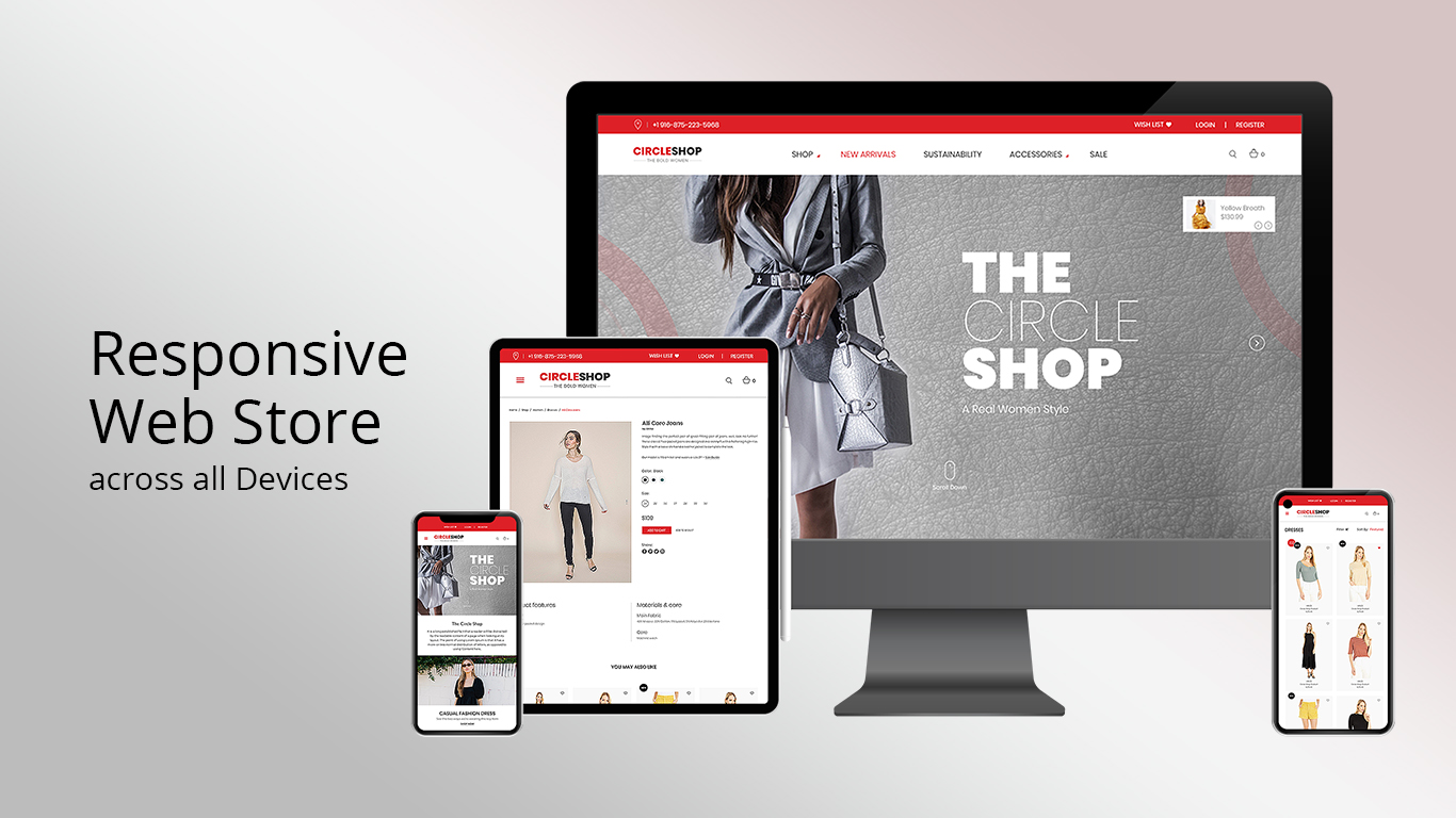
Responsive Review: Optimize Across All Devices


From Desktop monitors to iPhones and Androids 'Responsive Design' is the term used to describe how your e-Commmer Web Store resizes itself and reorders the text and image elements, depending on the size of the display device.
Make sure your eCommerce store is fully responsive with our Responsive Review service.
We assess and fix visual issues on various devices, ensuring your site looks great on desktops, tablets, and smartphones.
Boost engagement with a fully Responsive Web Store.

-
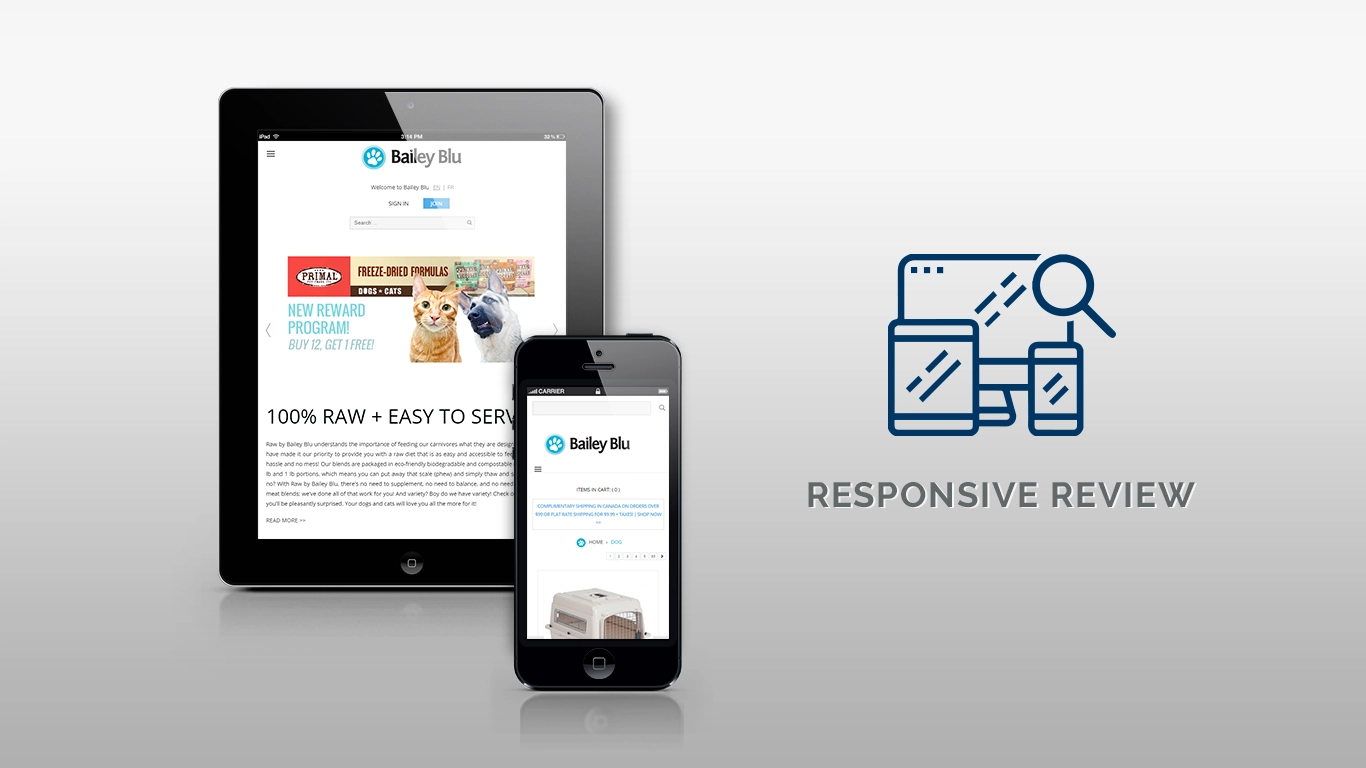
Responsive Review - Is your Web Store fully Responsive by Design, across all Devices?
-
Responsive Design review to fix those nagging resizing issues and custom redesign according to a specific template
-

Our 'Responsive Review' service, works with you to assess any visual issues you may already be aware of while we also do a comprehensive review of iOS and Android viewing characteristics and edit accordingly
Get an Estimate
Please fill in the following and we will send you an Estimate within 24 hrs, for Responsive Review.
There is no obligation, it is valid for 90 days and you can 'Accept the Estimate' as or when you are ready to proceed.
Alternatively, you are welcome to Contact Us directly to discuss.